
Picking up the right font might look like a minor detail, but it is incredibly important in business writing. It can help in building a brand image and giving a clear message to the audience. There are multiple formal font styles that businesses use to get a professional look and enable reader comprehension. In this blog, we will go through numerous different professional fonts to use while doing work like writing emails. So, let’s read on!
A Comprehensive Guide to Professional Fonts
Professional fonts are the types of text styles that you use while crafting business documents. These fonts allow the content to be visually striking and organized. This increases understanding and the readability of the text. When we talk about best professional fonts there are majorly two types that are Serif and Sans Serif. These fonts can ensure that your text looks modern and understandable. Below are the examples and more details about these fonts:
Sans Serif Fonts
The word “sans serif” means that the fonts is without any serifs. This means there are no small strokes present on the letters. This gives a simple and modern look to the text as sans serif has less width variation in contrast to serif fonts. The sans serif fonts are frequently used on soft copies that are viewed on computers, laptops, or phones. Here are some common sans serif fonts that you should know:
Calibri
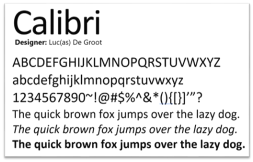
One of the most common fonts that people prefer due to clarity and better readability is Calibri. Whether you are writing headings, microcopy, or any other form of professional document, Calibri can be the perfect font. The best thing about this font is its versatility and legibility, it looks good and modern in both large and small sizes.
Lato
Another versatile font that is used by numerous businesses is Lato. The font is available in multiple forms such as thin, bold and others. The subtle details and the clean appearance make Lato one of the best business fonts. Designers use Lato as it is best for websites, branding, and editorial designs.
Futura
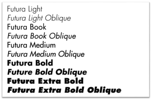
Futura is a San serif font that is known for its geometrical look. The letters are composed of lines and circles that give it a simple yet precise look. Organizations who want to make a strong first impression choose Futura to write their business content. The well-balanced look and the contemporary style make the text easy-to-read and gives a sleek look.
Arial
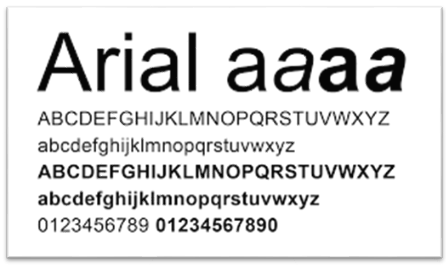
Arial is one of the highly accessible professional looking fonts that is used on various print and digital media. From presentations and documents to websites, Arial is a common choice of writers and designers. The font is simple and gives a sense of innovation to the audience.
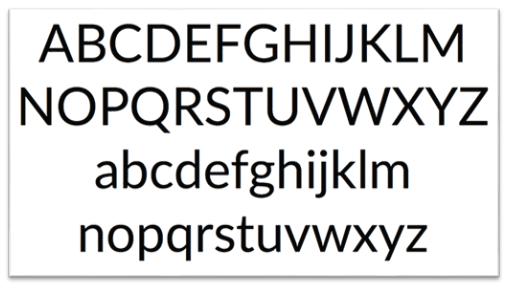
Roboto
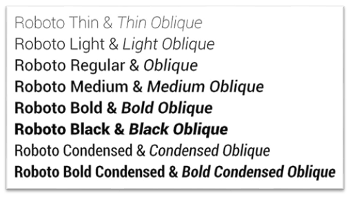
Roboto is a popular font as it is default in mobile android system. The design of the font is geometrical but with rounded letters. This keeps a balance between simplicity and professionalism of the font. You can find Roboto in different forms according to the typography needs. From bold, thick to thin and regular, you can choose the right font style depending on your need.
Helvetica
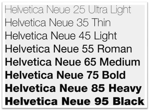
Helvetica is the top choice of well-known brands like Apple due to its simple letterforms and stroke widths. The font gives a bold minimalist look that brings elegance to the text. It is also highly versatile, and you might find this font on professional logos and websites to print material as well. If you choose Helvetica, the content will speak for itself and will spark the interest of the audience.
Serif Fonts
The small strokes present on each letter make the Serif fonts different from others. In comparison to Sans Serif, these fonts give a more traditional look due to the serifs. The majority of businesses use this professional font style in long form of content like magazines, eBook and more. Below are some business fonts that are used in professional writing:
Garamond
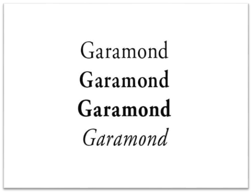
Garamond is a font that never gets old. It is a common serif font with an elegant and classic look. If your organization is looking for a font to give a formal look at their websites or documents, then Garamond can be the right one. The font can keep your text clean yet traditional for the audience.
Cambria
One professional font that we can’t miss is Cambria. It is designed with a simple yet sophisticated look. The strokes at the end of the letters enhance the overall text and increase the readability. The font is used for heading and body paragraphs on different forms of content like documents and publications.
Didot
If you need elegance and high contrast, then you should choose Didot font. This font is majorly used by all the big organizations and luxury brands. The reason behind the popularity of this font is the tall letterforms and modern aesthetic. When you write any text using Didot it brings sophistication.
Playfair Display
Playfair Display is an appealing font that makes the text stand out. It is an excellent choice for brands that encourage uniqueness and creativity on their website or any other document. The font has a classical typeface with well-balanced letters that ensures good readability.
Century Schoolbook
Century Schoolbook gives a straightforward design with clear letters that are easy to understand. The font has rounded serifs that gives web accessibility. It is one of the best formal fonts that offers a good blend of traditional look and functionality.
Let’s Wrap Up
Alot of people overlook the font type or size when creating professional documents, presentations or websites. However, font can play a major role in ensuring good communication with the audience. In this blog we have discussed different types of fonts that include both Serif and Sans Serif. By understanding these fonts, you can take your professional communication to the next level.