In the realm of digital documentation and design, Microsoft Word stands tall as a versatile and ubiquitous tool. The impact of fonts on visual aesthetics cannot be overstated, and when it comes to exuding an air of sophistication, cursive fonts reign supreme. This guide takes you on an immersive journey through the world of cursive fonts in Microsoft Word, unraveling their charm and imparting expert tips for their effective use.
What is a Cursive Font?
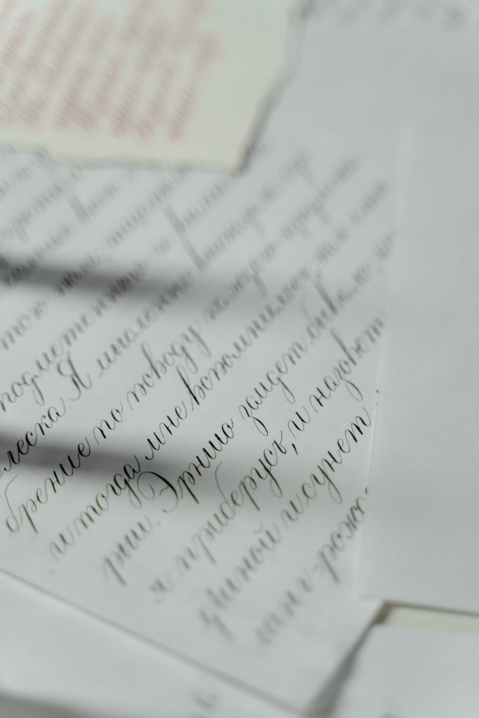
Cursive fonts connect letters together, creating a flowing and elegant aesthetic reminiscent of handwritten text. They come in various styles, from formal and classic to playful and whimsical.
Think of it this way:
- Standard fonts are like typed letters, each individual and distinct.
- Cursive fonts are like beautiful handwriting, where letters flow seamlessly.
Why Use Cursive Fonts in Word?
Cursive fonts can be a powerful tool for:
- Adding a personal touch: For invitations, greeting cards, or letters, cursive fonts create a warm and inviting feel.
- Creating a formal atmosphere: Certain cursive styles exude elegance and sophistication, perfect for certificates or official documents.
- Standing out from the crowd: Cursive fonts can make your documents visually distinct and memorable.
Cursive fonts are not a one-size-fits-all solution. Consider the context of your document before choosing a font.
For instance, a playful script might be ideal for a birthday invitation, while a classic calligraphy font would suit a wedding invitation.
Finding the Perfect Cursive Font in Word
While Microsoft Word offers a limited selection of built-in cursive fonts, the world of downloadable fonts is vast! Here’s how to find the perfect cursive font for your needs:
- Explore Word’s Built-in Options: Word provides some basic cursive fonts like “Edwardian Script ITC” and “Brush Script MT.” These can be a good starting point, but they might feel limited for creative projects.
- Download Free Fonts: Numerous websites offer free, high-quality cursive fonts. Be sure to download from reputable sources to avoid malware.
Here are some popular websites to explore:
- Google Fonts (https://fonts.google.com/)
- DaFont (https://www.dafont.com/)
- 1001 Fonts (https://www.1001fonts.com/)
- Invest in Premium Fonts: For a wider selection and unique styles, consider purchasing fonts from professional designers. These fonts often come with extended licenses for commercial use.
Remember: When downloading fonts, check the license agreement to ensure it allows use for your intended purpose.
Accessing and Applying Cursive Fonts
Navigating to the Font Menu:
Launch Microsoft Word and locate the Font menu under the Home tab. Here lies the gateway to a world of typographic creativity.
Choosing Cursive Fonts:
Scroll through the font list to find a plethora of cursive options. Some popular choices include:
- Calibri (Body):
Description: Calibri is a modern sans serif font that offers a clean and crisp appearance. Calibri’s cursive variant maintains its modern vibe while providing a subtle touch of elegance.
Style: Modern, versatile, legible.
Best for: Professional documents, presentations, resumes, and modern designs.
- Brush Script MT:
Description: Brush Script MT embodies a handwritten appearance, resembling brush strokes. It exudes an informal and playful charm, making it suitable for casual and creative designs.
Style: Playful, informal, brush-like strokes.
Best for: Invitations, greeting cards, artistic projects, casual designs.
- Edwardian Script ITC:
Description: Edwardian Script ITC is an elegant and elaborate cursive font reminiscent of traditional calligraphy. It features intricate loops and curves, making it ideal for formal and upscale designs.
Style: Elegantly elaborate, formal, calligraphic.
Best for: Wedding invitations, certificates, formal announcements, luxurious designs.
- Lucida Handwriting:
Description: Lucida Handwriting is a legible and clear cursive font with a handwritten feel. It strikes a balance between simplicity and elegance, making it versatile for various design contexts.
Style: Simple, readable, handwritten.
Best for: Personal letters, notes, educational materials, informal designs.
- Vivaldi:
Description: Vivaldi is an ornate and decorative cursive font that exudes a sense of opulence and grandeur. Its intricate details make it suitable for projects that demand a lavish touch.
Style: Ornate, decorative, opulent.
Best for: Event invitations, formal announcements, luxury branding, artistic designs.
- Corsiva:
Description: Corsiva is a classic and graceful cursive font with slanted characters and flowing strokes. It combines readability with a touch of sophistication, making it adaptable to various design styles.
Style: Classic, graceful, slanted.
Best for: Body text in elegant documents, invitations, headings, versatile designs.
- Freestyle Script:
Description: Freestyle Script has a casual and friendly vibe, resembling handwritten text. Its flowing strokes and varied letter heights add a touch of informality and warmth to designs.
Style: Casual, friendly, handwritten.
Best for: Informal invitations, personal correspondence, creative projects, playful designs.
- Kunstler Script:
Description: Kunstler Script is a whimsical and artistic cursive font that embraces a handcrafted appearance. Its irregular strokes and quirky charm make it suitable for projects that aim to stand out.
Style: Whimsical, artistic, irregular.
Best for: Artistic posters, creative designs, unique branding, unconventional projects.
- Palace Script MT:
Description: Palace Script MT is a regal and refined cursive font with an air of sophistication. It features elegant loops and curves, making it a suitable choice for projects that demand a touch of prestige.
Style: Regal, refined, sophisticated.
Best for: Formal invitations, prestigious events, certificates, high-end designs.
- Zapfino:
Description: Zapfino is an intricate and elaborate cursive font that mimics the look of hand-drawn calligraphy. It boasts multiple variations for each letter, providing a truly authentic handwritten feel.
Style: Intricate, elaborate, calligraphic.
Best for: Artistic projects, decorative text, luxury branding, custom designs.
Each of these cursive fonts brings a unique flair to your designs, catering to different aesthetics and purposes. Experimenting with these fonts in Microsoft Word can add depth and character to your documents, giving them a personalized touch that captures the essence of your message.
Adjusting Font Size and Style:
Tailor the font size and style to suit your document’s purpose. Experiment with bold, italic, and underlining to emphasize certain words or phrases.
Pairing Cursive Fonts
- Serif and Sans Serif Combinations: Merge cursive fonts with serif or sans serif fonts for a harmonious blend of classic and modern styles.
- Bold and Italic Variations: Create emphasis by combining bold cursive headers with regular text or employ italics to convey a sense of elegance.
- Enhancing Readability with Contrasting Fonts: Pair a legible sans serif font with a flowing cursive font to strike a balance between readability and aesthetics.
Popular Cursive Fonts for Word (Table Included)
Here’s a table showcasing some popular cursive fonts for Word, categorized by style:
| Category | Font Name | Description |
|---|---|---|
| Formal | Lucida Calligraphy | Elegant and sophisticated, ideal for certificates and formal invitations. |
| Classic | Script MT Bold | A timeless script font with a touch of personality, suitable for various applications. |
| Playful | Lobster | A fun and whimsical script, perfect for birthday cards or children’s projects. |
| Modern | Pacifico | Clean and contemporary script, ideal for social media graphics or informal invitations. |
Tips for Effective Cursive Font Usage
- Purpose and Audience: Tailor your font choices to your document’s purpose and target audience. Formal documents may benefit from elegant cursive fonts, while playful designs could employ more whimsical options.
- Consistency and Readability: Maintain consistency in font choices to ensure a cohesive design, and prioritize readability above all.
- Limited Use for Emphasis: Reserve cursive fonts for headlines, titles, or select quotes to avoid overwhelming the reader.
- Avoiding Overuse: Exercise restraint to prevent cursive fonts from overpowering the overall design.
Crafting a Handwritten Aesthetic
- Using Text Effects and Formatting: Experiment with text effects like shadows, highlights, or textures to imbue cursive fonts with a tactile quality.
- Inserting Signature Lines: Add a touch of authenticity by inserting a signature line using cursive fonts for a personal or formal touch.
Tailoring Cursive Fonts to Perfection
- Kerning and Letter Spacing: Fine-tune the spacing between letters to enhance legibility and visual appeal.
- Ligatures and Stylistic Alternates: Access advanced font features to enable ligatures (joined letter combinations) and stylistic alternates, which can further elevate the aesthetic of cursive fonts.
Saving Customized Cursive Font Styles
Harness the power of Microsoft Word by saving your customized cursive font styles as presets, allowing you to consistently apply your signature aesthetic to future projects.
Conclusion
Cursive fonts are more than just characters on a screen; they embody a timeless elegance that transcends the digital realm. Armed with the knowledge of how to access, apply, and pair cursive fonts, as well as expert tips for their effective use, you’re equipped to infuse your documents with an air of sophistication and artistry. Mastering the art of elegance through cursive fonts in Microsoft Word is a journey that promises to enrich your design endeavors and captivate your audience’s senses.
Cursive fonts, especially the ones mentioned above, work great for e-signatures. MyLiveSignature offers various e-signature font designs for its users. Now, you can personalize your signature according to your preference.
Key Takeaways
- Cursive fonts add a touch of elegance and personality to your Word documents.
- Consider the context of your document when choosing a cursive font.
- Explore built-in options, free downloads, or premium fonts to find the perfect match.
- Always check font licenses before using them for commercial purposes.
FAQs
Q: Can cursive fonts be difficult to read?
A: Some highly decorative cursive fonts can be challenging to read, especially in large blocks of text. It’s best to use them sparingly or for short phrases.
Q: How do I install downloaded fonts in Word?
A: The installation process can vary slightly depending on your operating system. Generally, you right-click on the downloaded font file and select “Install” or follow the provided instructions.
Q: Are there any limitations to using cursive fonts?
A: While beautiful, cursive fonts might not be suitable for all situations. For documents with heavy text content, prioritize readability over aesthetics.